|
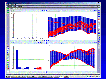
This is an example of analyzing simulation results.
The effects of two parameters (shown in the scatter plot)
on some spectral responses are being studied.
The distribution of a relevant figure of merit is
shown in a histogram. Cases with an unfavorable figure of merit
are highlighted. Broadcasting the selection reveals two different types
of problematic responses and the design parameters causing such problems.
|

|
|
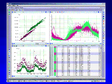
In this example, the upper-left scatter plot reveals
two previously unknown clusters. Coloring the clusters differently
separates the data into two classes. Each class
is found to associate with different patterns in
other attributes, including a hourly time series, a daily time series,
and a table in date order. Jointly these tell the story of different
usage patterns between weekdays and weekends in a telecommunication system.
|

|
|
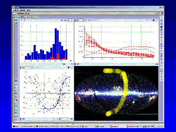
Here a histogram displays the distribution of one of the data
attributes, a scatter plot shows the values of two attributes, and
another plot shows a set of feature vectors in parallel coordinates.
The data entries are selected by their positions in an image.
The selection is being broadcasted to other plots.
|

|
|
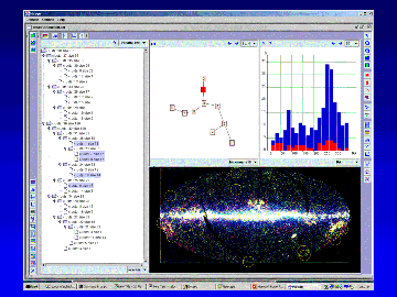
Two different proximity structures have been computed for this set of
data. The hierarchical structure is shown as a cluster tree on the
left. The partitional structure is shown as a graph which is a
minimum spanning tree connecting the cluster centers. The highlights
correspond to one step on a leaf-to-leaf walk in the cluster graph (the MST).
|

|